//]]>
random

عنوان الموضوع

نبذة عن الموضوع

عنوان الموضوع

نبذة عن الموضوع

عنوان الموضوع

نبذة عن الموضوع

عنوان الموضوع

نبذة عن الموضوع

عنوان الموضوع

نبذة عن الموضوع

التسميات

‏إظهار الرسائل ذات التسميات apple. إظهار كافة الرسائل

السبت، 23 يوليو 2016

OS X El Capitan


El Capitan, the latest update to Apple's OS X operating system, is named after a massive rock formation in Yosemite National Park in California -- keep that in mind. It's a free update, and you can download it starting on Wednesday, September 30.
The previous version of OS X, called Yosemite, represented a sea change for OS X, sporting all new aesthetics, features such as Continuity and Handoff that bridge the gap between iOS devices like your iPhone, and Spotlight's newfound ability to search pockets of the Web. El Capitan is, by contrast, restrained. Where Yosemite was concerned with introducing new features to modernize the OS, El Capitan, like its namesake pillar, sits upon that foundation.

There are of course refinements to discover, including improved takes on multitasking and more efficient ways to search. Performance has been improved -- and will tick up further as more developers begin to use Apple's Metal programming interface -- and tiny quality-of-life improvements have wormed their way into most every native app on the platform. If you're wedded to the Apple ecosystem, your entire universe will become just a little more cohesive.
El Capitan is more evolution than revolution, but it's the next step in Apple's relentless march towards efficiency, chock full of improvements along the way. And it'll run on just about every Mac purchased in the last few years: if your Mac can run Mavericks, you're all set. Let's take a look at what's new.
With El Capitan, the native OS X apps you're already familiar with have learned a new tricks -- some borrowed from iOS. The end result is an operating system that accomplishes more while retaining its simplicity, all the while subtly bridging the gap between PC and mobile without ever explicitly crossing over.

Get a bird's eye view with Mission Control

Apple's Mission Control has been around in some capacity since Mac OS X Lion, and works a little like multitasking on your iOS device. Swipe up on your trackpad with three fingers, press the Mission Control button on your keyboard, or set up a keyboard shortcut, and you'll get a glance at all of the apps and virtual desktops -- Apple calls them "Spaces" -- that are running on your Mac. You can rearrange them at will or let them shuffle around automatically, based on use. And any apps you run in fullscreen mode will get stored up there too.
Click an app on the desktop in El Capitan and drag it up to the top of your screen, and you'll automatically enter Mission Control, where you can drop the app onto another desktop. That's a simple tweak, but one that saves you precious seconds, and then gets back out of your way. Mission Control has itself been streamlined: When you're just trying to get a bird's eye view of your desktop, the other spaces you're running in the background will be condensed to their titles. You won't get the full thumbnail until you actually mouse up to the bar -- the space you're saving won't mean much on aniMac or 15-inch MacBook Pro, but the change is well in line with El Capitan's focus on keeping things simple.
I see echoes of Mission Control in Microsoft's efforts with Task View in Windows 10 , the first official implementation of virtual desktops in Windows. The functionality of Task View and Mission Control is similar, but Apple's implementation has spent more time in that proverbial oven. There's currently no way to rearrange existing desktops in Windows 10, for example, and the feature there is reliant on buttons, keyboard shortcuts or touch gestures. Of course Windows 10 has been iterating rather quickly, so it stands to reason that we could see these sorts of quality-of-life improvements work their way into Microsoft's OS before long.

Multitasking with Split View

Multitasking is at the heart of Apple's changes with Mission Control and Split View -- a feature borrowed from iOS 9. The principle is that same as its iOS counterpart: Drag an app onto another fullscreen app, in Mission Control mode, and you can join the two onto a single space. Each will naturally take up half the screen with a vertical black bar dividing them -- drag that bar left or right to give one app more room. Alternatively, you could press and hold the green fullscreen mode button in the top left corner of your app. A blue sheen will cover half of either side of the screen; drag the app to the left or right, and the rest of the apps on the desktop will be shrunk down into thumbnails, a la Snap in Windows 10. Click one, and it'll take up the opposite half of the display.
For the right person, Split View will be a great focus aid: I do most of my writing in Microsoft's OneNote, but can keep a browser on the opposite end of the screen in case I need to look something up, or track down a source. I also keep Wunderlist and the Calendar app side by side on another desktop, so I can keep tabs on my schedule as well as my to-dos. You can also flip an app over from the left or right by grabbing the title bar and dragging it over its neighbor -- they'll swap places. Some apps (like Calendar or Pages) have a minimum amount of screen real estate and will shrink no further, while apps such as Wunderlist will transform, hiding menus and changing their layouts to squeeze into tighter spaces.
None of this is likely to matter if you avoid fullscreen apps, or are using a larger display, where you'll have a desktop with plenty of room to roam. But it can work wonders on smaller devices such as the12-inch MacBook, where too many windows would feel cluttered, but a single one would see you jumping between desktops.
Split View is of course reminiscent of Windows 7's Snap -- one of my favorite Windows features. Snap has been much improved in Windows 10, and is a bit more versatile than Apple's efforts. You can snap up to four apps onto your display -- one in each corner -- or sit one on the right half of your screen, and stack two on the left. You'll run into the opposite problem from Split View here, as stacking four apps in a single space only really makes sense on larger displays.

Seeking with Spotlight

Spotlight has been a mainstay of OS X since 10.4 Tiger, and has served the same purpose: helping you find stuff. That "stuff" category has grown substantially since its inception. In Yosemite, Spotlight gained the ability to look beyond the dictionary or files on your Mac and onto the Web, to find information from Wikipedia, or location-based results. El Capitan takes things further still. Type "weather in Tokyo" and Spotlight will offer up weather results and the forecast for the upcoming week. Spotlight can also tackle natural language searches. Typing "photos I took in Oakland last fall," for example, will trawl through your images for shots that meet those criteria.
You can search for more general information, too. Type in the name of a sports team, and Spotlight will show you the results from the last game, and a peek at their upcoming schedule. Type in an athlete's name, and Spotlight serves up an info card with their stats. You'll also find links to their Twitter profile, related websites, blurbs from recent news articles, and even videos they may have been featured in.
But while Spotlight does have a rather expansive knowledge base and will do a good job of trawling the Web for the information you're seeking, it still doesn't do general Web searches. I often find myself looking for info on obscure topics, like this "screaming chicken dog toy" that I bought off of Amazon, or the "yawning Totoro toy" I received as a gift once upon a time. On Windows 10, Cortana fires up a browser window with Bing search results. On a Mac, Spotlight turns up a simple "No results."
Actually, that's not true: I'm writing this in Pages as part of my full-immersion OS X experience, and those search results are now turning up as part of this document. Spotlight is nothing if not thorough.

New and improved Notes

El Capitan brings new features to core elements of the operating system, but it also spruces up some of Apple's native apps. Of particular note is, well, Notes. There are plenty of competitors in this space, including OneNote and Evernote. Notes doesn't hold a candle to those: You won't find a place to store your files or take voice notes. But if you just want a quiet place to drop some text, maybe that's a good thing.
The new Notes is leagues ahead of its predecessor, bolstering those basic text-wrangling abilities. You can quickly create checklists to roll your own to-do lists, as well as format text to add a bit of style to your notes. You can use the Share function built into apps like Safari to add links, photos and videos to your notes -- third-party apps can get in on the action, too. And syncing over iCloud means that the doodles you create in Notes on iOS 9 will show up here too. This isn't going to replace any of the tools I'm already using, but if you aren't tied to a particular app and have a number of Apple devices, this simple tool might just be robust enough for your needs.

the new iOS 9


     siri/design and maps 

iOS 9 launched this week and it's already a lot better than iOS 8, thanks to new features that make the iPhone and iPad software easier to use.Siri is smarter, Apple Maps has been improved and the notifications drop-down menu is now sorted logically. Best of all, every device that works with iOS 8 works with iOS 9.iPads get benefit big from this year's operating system update. New iPad multitasking functionality, especially for the iPad Air 2, finally fulfills the tablet's promise of productivity on the go.
While iOS 9 lacks some key Android features, there's a lot to like about iOS 9 ahead of the iPhone 6S and iPhone 6S Plus launch next week, and iPad Prorelease date in November.

iOS 9 compatibility and download size

iOS 9 isn't about a fresh coat of paint like iOS 7 was, it's about rust-proofing glitchy software that launched alongside iOS 8 last year. Everything is designed to run smoother, and it does.


There are fewer app crashes and hard restarts required compared to when iOS 8 first came out. I've experienced no white screen of death problems so far, just occasional design flaws.
Even better, iOS 9 works with devices as old as iPhone 4S and iPad 2. Apple didn't axe any old phones or tablets from its compatibility list in the transition to the new operating system.
It was also a relief to see that this free update is a 1.4GB file and doesn't require the 4.7GB free of space to install on your tiny, 16GB devices.

Siri and search

The most obvious iOS 9 change involves Siri and spotlight search. Sliding to the left-most menu reveals a robust list of "Siri Suggestions," filled with your most recent contacts and apps.
It provides quick access to your four most recent contacts and four most recent apps. There's a "show more" and "show less" toggle to increase that to the eight most recent. Sadly, you can't unpin and disallow certain apps from showing up before your parents see you're on Tinder.
Apple Maps gets some attention here, too. "Nearby" shortcuts are a fast way of finding Parking, Restaurants, Gas Stations and even Desserts, which all link to a Yelp review-filled Maps menu. In true Apple fashion, there's no customization or option to re-sort which shortcuts come first.
iOS 9 concludes this Siri-run search menu with news snippets from sources like the New York Times and CNN. Strangely, there are four headlines, but if you hit the rather stingy "Show More" text, it reveals a total of five. A glitch to be solved in the future, perhaps?
The news presentation here isn't as flashy as Samsung's Flipboard-based menu, which is also the leftmost Android menu on the Samsung Galaxy S6 and Galaxy S6 Edge. Apple saves the magazine-style stories for its new iOS 9 News app.

Holding down the iPhone or iPad home button to issue normal Siri commands leads to smarter answers. I randomly asked "Bring up photos from May 28, 2015" and Siri immediately opened the pictures I took at Google IO on that date.
I still find Google Now to be more advanced overall, but this same phrase on and Android just leads to my Samsung Galaxy S6 Active opening up random web results. That... doesn't really help, Google. Apple is catching up and boasts that Siri is 40% faster and 40% more accurate. It shows.

Notifications, recent and photo scrubbing

Smaller iOS 9 menu changes have solved big pet peeves I've had with iOS 8, one of which I felt Apple should just steal from Android.
Notifications are now sorted chronologically instead of illogically grouped by app. This was always a problem when I accidentally put my finger on the Touch ID home button, forever sending all time-sorted lockscreen notifications into the app-sorted notifications menu. Now they all reside in the swipe-down-from-the-top menu once the phone is open.
Apple re-stylized its Recent menu, which is the one you see when double pressing in the Home button. It now sports a larger Cover Flow format, rather than its former zoomed out look.
The more important change to the Recent menu is that there's a shortcut icon tucked away at the bottom for Continuity (an app open your nearby Mac, iPad, etc) and location-based apps (if you're at a store like Starbucks and have the app installed).
Previously, these icons were stuck on bottom left corner of the lockscreen, which meant locking your phone just to press the wake button again to access the lock screen shortcut. Now it's available in two spots, whether or not your phone is in a locked state.
Finally, flipping through the default Photos app is less of a hazard, because there's a mini slideshow at the the bottom of the app. It's the fastest way to scrub through photos and reduces the chance you'll bring up that embarrassing picture while showing someone other photos.

Apple Maps

  iOS 9 is the company's big push to improve Apple Maps, and it does just that... to     some extent. Namely, this comes through with long-overdue public transit      directions.
 Routes for buses, trains, subways and even ferries are here, and I put it to the test  on the New York City subway while navigating Manhattan. I survived this Apple  Maps expedition without booting up Google Maps.

Besides New York City, transit directions are available in Baltimore, Berlin, Chicago, London, Mexico City, Philadelphia, the San Francisco Bay Area, Toronto and Washington D.C. About 300 cities in China, including Beijing, Chengdu and Shanghai, are also getting the transit treatment.
Does it fix everything? No. The problem with Apple Maps wasn't just its lack of transit directions or too-often wrong routes, it was the fact that the app's design just couldn't compete with Google Maps. That's still the case.Google is busy adding ridiculously minute details, like chalking out your vacation dates to the map overtop of your hotel. Apple's cumbersome app won't let you finger ahead to see the next directions. It just springs you back into place. I can go from Los Angeles to London on Google Maps while in the middle of turn-by-turn directions if I wanted to. With Apple Maps, I can't look ahead one block.
While I appreciate its new Nearby feature that lets you discover stops along the way, Apple Maps' foundation is a little too flawed for me to give up on Google Maps just yet. It doesn't matter if Siri insists on opening up Maps whenever I ask for direction by voice.

Apple TV review


The new Apple TV is understated and subtly smart, but also underdeveloped


DESIGN AND INTERFACE

With the comparisons out of the way, let's move on to the design of the Apple TV. Overall the unit has the same premium feel you'd expect from an Apple product: It's glossy, sleek and completely understated.
It's bigger than I expected, though. It's about the size of two old Apple TVs stacked on top of each other and then fused together with an still-pretty-fresh A8 chip at the helm of the ship.
As you might expect, it pairs nicely with the new Siri Remote, the primary way you'll control your new piece of plastic though, Apple has recently re-released its Remote app for iOS with new Apple TV support giving you a choice in the matter.
But, despite how it sounds so far, just know it's not sunshine and rainbows in Apple's venture into the living room.

Design

Let's start with some stats. The Apple TV is, again, about twice the height of the last iteration but not much wider at 1.4 x 3.9 x 3.9 inches/35 x 98 x 98mm (H x W x D). It's a small footprint for a video streaming box, and one that seems even smaller when combined with its sleek black, inconspicuous exterior.
Speaking of the exterior, there's not a lot to see on the box. There's a small white LED indicator on the front of the unit and an Apple logo carved into the top. It's about as minimalist as an Apple-designed product has ever been, and that's a very good thing.
Spin the unit around you'll find your standard 10/100BASE-T Ethernet, HDMI 1.4 and USB-C ports, though the latter is only used for service and support. It's not all that exciting, honestly, especially considering the last Apple TV came with an optical audio-out connection.

At least the technology packed on the inside of the Apple TV is a different story.
For starters you'll find a much-improved Apple A8 processor, a proprietary chip the Cupertino company uses in the iPad Mini 4, iPhone 6 and iPhone 6 Plus. It also supports 802.11ac Wi-Fi, which should offer faster, uninterrupted streaming for anyone upgrading from an older model.

Siri Remote

The main attraction however is the new Siri Remote. The remote, alongside the new tvOS, are the two biggest reasons to jump onto Apple's living room bandwagon.
Feature-wise, the Siri Remote sports a built-in microphone for Siri support and a matte touch pad, as well as a number of sensors developers are still wrapping their heads around.
There are only six buttons on each unit (seven if you're including the touchpad, which can be clicked down), but really you'll mostly use the top two buttons - menu and TV. Menu is a faux back button while TV takes you back to the home screen. It's not the most intuitive setup, obviously, and one which Apple can improve upon in the future.

But what I do like is that the Siri Remote doesn't use batteries. You'll recharge the remote by plugging the included lightning cable into any USB port on your laptop or PC. This could be problematic down the road once the battery starts to wear out, but battery life isn't a huge concern as the remote has yet to die after a week of testing.

Interface

With the remote in hand and your unit set in the center of your entertainment space, it's time to plug in and enjoy your new hardware.
Setup takes minutes and can either be done by manually entering information using the Siri Remote (this is not recommended) or by syncing the unit with your iPad or iPhone via Bluetooth.
The latter pulls all the data it needs - your Wi-Fi network ID, the password and your iTunes account info - in a matter of seconds and brings you to the stunning new home screen. (Editor's note: If you don't want your data to be shown and distributed to potential advertisers, make sure you check the "do not share my information" box when prompted during setup.)
The UI is divided into three main parts: a highlight bar that can store five apps and show real-time updates or highlighted content from those apps (the second area), and an area where the rest of the apps live underneath.


Introduction and oveview

Update: Apple TV recently brought BitTorrent Now, a music and video streaming platform offers pay and ad-supported content, to the App Store.
Original review continues below...
If it existed in a bubble, the new 2015 Apple TV would be a stellar product. It offers a steady improvement over its three-year-stagnant predecessor - a device built for the then revolutionary new standard of 1080p - and comes with one of the most premium remotes on the market.
If there was nothing to compare it to, it'd be hard to point out the number of flaws the system has. It's lacking the majority of Australian streaming apps, for example, and Siri recognises less than half the commands on the new Apple TV than it does on iOS, watchOS or OSX.
The situation is improving. At WWDC 2016 Apple noted that 1,300 video channels have now made it to the device alongside 6,000 native apps.
That's not to mention the fact Siri is voiceless at the moment, relying on text and graphics to respond to any inquiries you might have.
Siri has had a major upgrade promised at WWDC 2016 however. Soon you'll be able to use Siri to search for film categories, as well as to search YouTube or even channel live streams.
The remote itself I really like, as do many of the developers I've spoken to about it. But it isn't the panacea Apple marketed it as. Entering text one letter at a time for a password is tedious, and even though you can now pair your Apple TV to your iPhone or iPad to enter text, it's still not an intuitive solution.
Thankfully at WWDC 2016 Apple announced that the remote's functionality would be coming to a dedicated iOS app. As well as offering touch navigation, Siri voice recognition and motion controls for games, you will also be able to use the keyboard on your iOS device to search for content. A very welcome addition indeed.
But that's the snag with the new Apple TV: it's just shy of being the product we were promised.
It might very well be one day once the system grows up, gets a few patches and more developers see the same promise in the living room they see in our pockets and tablets. But, for now, there's a lot of work that needs to be done and the competition shows no signs of going easy.
Before we dig into the latest prodigal fruit from Apple, let's first delve into the core of what made the original three Apple TVs worth buying.

Apple TV: What is it?

The Apple TV in question or, more precisely, what the company is calling the new Apple TV, is the fourth iteration of a "hobby project" Steve Jobs started in 2006. Jobs' vision was to create a dead-simple entertainment hub, one that could access your media in a few simple steps.
That came to fruition in 2007 with the first Apple TV. (Apple wanted the name iTV, however the major British broadcast network of the same name threatened to take legal action should Jobs brand Apple's new device using that moniker.)
In the time since then we've seen two sequels that upgraded the internal Wi-Fi antenna from 802.11b to 802.11a/b/g/n before landing on 802.11ac for the latest build. The processor has been radically changed in that time, too, starting at a 1 GHz "Dothan" Pentium M equipped with 256 MB and ending on a vastly improved 64-bit Apple A8 processor.

Yes, a lot has changed since the first Apple TV. There's less hard drive space on the new unit, ironically, but that's because streaming has overtaken the notion of owning content.
Speaking of hard drive space, the new Apple TV comes in two sizes and price points: The 32GB version costs $149 (£129, AU$269) while the 64GB version comes in at $199 (£169, AU$349). The only difference between the two is the amount of memory which, considering how small most streaming apps are, means the former will probably have sufficient space for years to come and offers the better value right now.

The new Apple TV is driven by apps of all shapes and sizes, not just first-party ones anymore. For the first time ever you'll see the wealth and power of the Apple App Store in the living room, and I expect that once the system matures it will be a sight to behold.
And, unlike the bastardized OS of systems past, the new plastic runs a platform of its own called tvOS, a nomenclature taken from the Apple Watch's watchOS.
What hasn't changed is that Apple still cares first and foremost about Apple products. The new Apple TV works best with iPads, iPhones and Macs thanks to Apple AirPlay and will allow you to easily stream content from your phone or tablet to the big screen.
And while there have been steps taken to make the system feel less Apple-centric, the iTunes store stands firmly in the center of everything. Every search includes results from iTunes. Every purchase goes through iTunes. You can't go more than five minutes without being shown some new TV show or movie that, as soon as you click on it, will bring you back into the icy-cold money-loving hands of Apple's ecommerce magnate.

Apple TV vs the competition

If you're entrenched in the Apple ecosystem (by which I mean you buy movies and shows from iTunes, subscribe to Apple Music and/or stick to phones and tablets running iOS), then the Apple TV will be a supremely good addition to your living room that will only improve with age.
The less of those features you care about, however, the less you'll like the new Apple TV against the other extremely strong contenders in the streaming video space.

Apple watchOS 2: everything you need to know

Apple watchOS 2: everything you need to know


Update: Apple has now announced watchOS 3 and the new software update will be coming to Apple Watch devices in the near future. You'll be able to get it on your Apple Watch later this year. For now though you'll get to explore all the latest and greatest watchOS 2 features.
WatchOS 2 launched in September 2015 with a plethora of new features and updates to Apple Watch features you already loved.
Since then, we have seen it updated four times and the latest software for your wearable is watchOS 2.2.1, which is based on iOS 9.3.2.
If you haven't updated your software already, it's certainly worth doing. Siri is smarter, public transit will show up in Maps and there are new watch faces. If you own an Apple Watch, here are all the key reasons you should upgrade it to the latest software.

Apple watchOS 2 release date

It's out right now and you'll likely already have it on your watch. If you don't, you'll be able to download it now.

Apple watchOS 2 latest upgrades

WatchOS 2.2.1 is the latest software upgrade and most of the upgrades since the original watchOS 2 release have been minor improvements.
There have been a lot of fixes to stability issues and even the latest upgrade - watchOS 2.2.1 - just focused on performance issues.


Problems have been fixed such as limits on only being able to pair one Apple Watch with your phone, calendar issues and third-party app icons breaking. There's also support for a new range of languages for those who can speak multiple tongues.
WatchOS 2.0.1 was perhaps the most important though as it fixed issues with the battery performance as well as bringing in the new emoji characters that were included on iOS 9.1.

New apps

WatchOS 2 brought a new selection of third-party apps with it. The Facebook Messenger app for Watch allowed you to be able to text, send audio files and share locations right from the wrist.
GoPro can lets you use the Apple Watch as a viewfinder so that no matter where your camera is mounted, you'll always know where it's pointed. iTranslate lets you see, hear and translate over 90 languages by speaking to your Watch.
This was all possible as devs now have access to the smartwatch's sensors and controls like the Taptic Engine, Digital Crown and more. It means we're beginning to see native apps for the platform, opposed to ones that are simply ported over. Native apps allow faster run time and greater app capabilities.

Sensors and controls

The Digital Crown provides functionality beyond zooming in and out. Rotating the crown lets you 'Time Travel' showing various events up to 72 hours into the future or past events, right on the watch face. Weather and news headlines are also other complications that Time Travel will work with.
It's cool seeing what the weather will be like, and if you've got your calendar set up perfectly it's neat to see what appointments are coming up.
But until more third-party apps offer complications for this section, we can't say we're enamoured.

The microphone is accessible to other apps now, which means developers are also be able to use your voice in their builds.
Developers now have access to the accelerometer too, so you can expect future apps to utilize this feature more.

Watch display settings

Previously capped at 15 seconds, the Apple Watch is now able to stay on for a whopping 70 seconds; why you'd need this we've not quite worked out, but that option is nice to have.

Tetherless Wi-Fi

Yes, this sounds exactly like what you think it is. The Apple Watch is able to connect to open Wi-Fi networks without needing to connect to your iPhone first. You can leave your phone in another room and your wrist will be a perfectly suitable alternative.
It's been hard to find a time to put this into practice though – you can keep the Watch connection alive in most homes thanks to being close enough.

Watch faces

There were 10 customizable Apple Watch faces at launch, and as we expected we've now got more to play with.


Modular looks much nicer with more colors to play with (along with the extra complications to check out).Time Lapse: Apple shot time-lapse videos over 24 hours in Hong Kong, London, Mack Lake, New York and Shanghai to create these new faces, and Paris was recently added to the mix. This is one that we're really in to, as it adds an element of dynamism to the Watch, with movement every time you lift your wrist.
It would be brilliant if you could film your own time-lapse here and code it to the correct time stamps; given that the iPhone 6S is going to have a stabilized time-lapse mode, this could be awesome.
Photo and Album modes: Just like iPhone backgrounds, your collection of pictures is now fodder for your smartwatch faces. It takes a bit of work to get the right photos on there (you have to choose a specific folder to use and then sync it to the Watch), but it adds a really personal touch to your wrist.

It's hard to work out how to get a single photo on the background though – you'll need to fiddle around a lot to make this work.
Live Photos, enabled from the iPhone 6S by taking a 1.5-second video before and after the shot, will be able to play automatically on the Watch. So if you're thinking of getting a joint bundle of Apple products, you'll like this dynamic new feature.

Apple Watch Music

The interface for Music looks a bit different after the update as it's been redesigned with new features. Quick Play has been added to make it easier to shuffle your music, a volume level indicator will be displayed, and the source of the audio file will also show up.


Complications

New 'complications' or information in the various watch faces will be able to display third-party apps, although we've currently not seen much from apps that can be added in here.
Flight times and home-controlled systems with Homekit devices will be accessible from your wrist, and your electric car charging information and more should show up soon. The complications can be changed on the Modular face and most of the other faces.

Nightstand

Nightstand mode flips your Apple Watch face to show horizontally while it's charging. The Digital Crown becomes a snooze button and the side button turns off alarms. If you're not a fan of lights, the display screen won't show unless you touch it or one of the buttons.
It also begins to light up as you get closer to your alarm time – while it's never woken us up with the gentle glow, it's a nice mini alarm clock to have by your side.

Email replies

One option that has been sorely missing has finally made it onto the Apple Watch: email replies. Just like text messages, you're now able to reply directly from your wrist with voice dictation, emojis and smart responses. However, you can't edit your messages – this is more about being able to archive or flag messages from the wrist, rather than them being locked into your phone.

الخميس، 21 يوليو 2016

iPad Pro 9.7


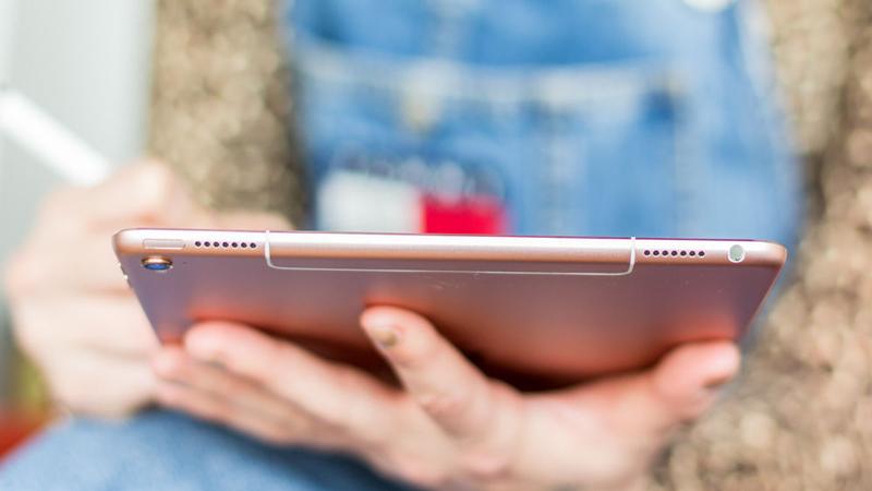
The iPad Pro 9.7in, Apple's appealing new mid-size tablet, proves that while laptops might still be the best tool for working on the go, they're no longer necessary. In our 9.7-inch iPad Pro review, we evaluate the new iPad Pro's build quality and new features, put the device through our rigorous speed benchmarks and battery-life tests, and compare the value for money the 9.7-inch iPad Pro offers compared to other iPads (and rival tablets) on the market


iPad Pro 9.7in review

Welcome to Macworld's iPad Pro 9.7in review for the UK. If you'd prefer a larger-screen tablet, read our iPad Pro 12.9in review.
Apple unveiled a new mid-size iPad at its 'Let us loop you in' March press event, as we expected, but what we didn't expect was for this to be an iPad Pro. Rather than calling this the iPad Air 3, which it logically and visually appears to be, Apple is presenting it as a shrunk-down version of the 12.9in iPad Pro - and thereby attempting to position the new 9.7-inch iPad Pro as a work device suitable for replacing a laptop, and targeted particularly at designers and illustrators on the go.
But does it succeed? In our iPad Pro 9.7in review, we evaluate the latest iPad's design and build quality, weigh up the pros and cons of its new features, put the device through the Macworld labs' most rigorous speed benchmark and battery tests, and compare the value for money that the iPad Pro 9.7in offers compared to the other tablets on the market.
This is a general review of the iPad Pro 9.7in, but many of its prospective buyers will be digital artists, illustrators and designers keen to make the most of its compatibility with the Apple Pencil. If that includes you, then also take a look at the more design-focused review by our colleagues at Digital Arts.

iPad Pro 9.7in review: Summary of review

Design: Physically the iPad Pro 9.7 is a close match to the iPad Air 2: weight and dimensions are identical, as is the general design (which remains sumptuous, of course). You now get four speakers - two at the top, two at the bottom - and the bottom speakers are spaced slightly further apart. This results in a much fuller, richer sound - not exactly surround sound, but a far more immersive audio experience than we've come to expect from a tablet. Read more about the iPad Pro 9.7in's design
Cameras: One other noticeable physical change is the rear-facing camera, which now sticks out and will scratch on the desk if you lay the iPad flat on its back. Slightly annoying, that, although any sort of case will remove this issue, and you do get the payoff of a heavily enhanced camera setup. The rear-facing camera now has a flash, and has been pushed from 8 megapixels (on the Air 2 and the Pro 12.9in) to 12Mp; there are also numerous smaller improvements to this component.
The front-facing camera is even more dramatically boosted, going from 1.2Mp to 5Mp and gaining the Retina flash feature. We look at all this in more detail, and present a selection of test shots and comparisons, in the camera testing section, but suffice it to say that in some conditions you won't notice the difference from the Air 2's cameras, in others you'll notice small improvements, and in others it's in a whole different class. Read more about the iPad Pro 9.7in's camera performance
Screen: The 9.7-inch touchscreen Retina-class display is in most respects the same as that on the Air 2: same size, same resolution and pixel density, same sharply responsive multitouch functionality. But it adds a new (and optional) feature called True Tone, designed to subtly adjust the screen's colour output to account for environmental light conditions. And we do mean subtly - it's a similar kind of idea to Night Shift, producing a warmer, yellower colour palette under electric lighting, but to a much less noticeable degree. We imagine most users will only be dimly aware that the screen seems to have good colour output without being sure why; we saw a clear difference only by sitting it next to the (non-True Tone) iPad Air 2 in various conditions.Read more about the iPad Pro 9.7in's screen
Speed: Thanks to its A9X processor chip, the Pro 9.7 is significantly faster - at least on paper - than the Air 2, and in most tests very nearly as quick as the iPad Pro 12.9 despite having half as much RAM. For the time being you won't notice much difference between the Pros and Air 2, but the older device is sure to get left behind as more and more processor-intensive apps and games are released with the newest generation of hardware in mind.Read more about the iPad Pro 9.7in's speed benchmark tests
Battery: Early battery testing was also impressive, with the Pro 9.7 lasting, surprisingly, an average of 11hrs, 2m in GeekBench 3's highly demanding benchmark despite having slightly lower battery capacity than the Air 2 (which managed just 7hrs 40m). Both devices should last longer than that in general use. Read more about the iPad Pro 9.7in's battery performance

Accessories: Crucially for its credibility as a laptop replacement, the Pro 9.7 has launched alongside a new keyboard case, a 9.7in version of the Smart Keyboard, and like the Pro 12.9 it features a port on its lefthand edge for connecting to and powering this accessory. It's about as good as an ultraportable keyboard of its size could be, but nowhere near as accurate to type on as a conventional keyboard (and some way behind the larger 12.9 version of the Smart Keyboard, too). It does a job, but you'll need to rely on either a solid autocorrect (like the one in Pages), frequent manual corrections, or just lots of practice.
You can also now use the Apple Pencil stylus, which is pretty wonderful, but expensive. Read more about the iPad Pro 9.7in's accessories
UK pricing: The Pro 9.7in starts at £499 in the UK, with prices rising to £839 for the 256GB cellular model. You're paying a premium, then, and many Apple fans will baulk at the asking price. But we think there are enough enhancements here to justify it, and business users - if they can live with the smaller and harder-to-use keyboard attachment - will get a lot out of this device. It's still a cool £180 cheaper than the Pro 12.9, remember, and that device doesn't get the True Tone display or most of the camera upgrades. Read more about the iPad Pro 9.7in's UK pricing
That's the summary of our iPad Pro 9.7 review, but let's look again at each of those areas in more detail - before finally giving our definitive verdict.


Twitter Delicious Facebook Digg Stumbleupon Favorites More